Global Component Library
What are components?
When we refer to components, we are reffering to the multiple elements that make up your web page.
Our designs are made up of custom designed templates and within these templates they are broken up into multiple blocks of components. Think of a popular modular childrens toy where you can swap and arange blocks in many different configurations to create a shape. Components are a bit like this. Each component has itself custom parameters on what it can do, as each component is different in the way it performs its job, not all components can do the exact same thing, but they may have similar functions.
All of our design templates feature components, but not all templates allow 'hot swappable' components, as some need some base components to display basic information, these cant be swapped out for others for example. However within the 'custom content' areas of 'Vacancy' designs and 'content pages', this is where we can swap out the 'content components'.
Below you will find all of the individual components that can be used across our products. Each component is presented below, showcasing functionality, along with customisation options.
Base Components
Base components are used across all of our products. These components may differ slightly across each of our products and the specific templates we build due to different presentations, therefore there may be different requirements depending on the template you choose. Any product or template specific information relating to these base components can be found on the corresponding product or template specific pages.
The logo which is pulled into each of our products comes from the main system logo we use for your client account. This means that this logo will remain the same across all of your products and build up a layer of consistency. We require this logo to be sent over either as a .SVG file or .EPS file. These two file types will allow us to present the best quality image of your logo across all of our products.
If you don’t have your logo as either of these file types then the next best thing would be a .PNG file which shows your logo with a transparent background (not a white background). This is still not ideal as if the logo was to be increased in size then some of the sharpness of the design would be lost.
Should you have any specialist specifications for working with your logo, usually laid out in brand guidelines, then please send these over so that we can work within these parameters.
- Uses system logo or nearest brand logo.
- Custom URL / Link possible.
- For maximum conversion: Display SVG logo.
- Styling not customisable. System Driven
The merge fields are what pull through the information specific to each vacancy or user and you can decide exactly what information is displayed. You will be able to discuss your desired merge fields during your consultation and these can be generic or specific to you.
The only thing we require from you is to tell us the information you’re wanting to display to your users and we will sort the rest. Whilst the information that is pulled through is fully customisable, the layout often cannot be customised.
- Merge fields available are defined by the implementation team.
- Maximum number of merge fields is defined by the template.
- Styling not customisable. System Driven
The header banner can differ across our range of products. It will generally sit at the top of a page and aim to reinforce your brand and provide important information to a user. The content and sizing of the header banner will be defined by each product and template.
- Style of media is defined by the template.
- For optimal conversion: Use primary brand colour.
- Customisation options available.
The header title component is used to introduce a user to a specific section within one of our products. This title can be used to introduce a paragraph of text, some text and an image, a video or anything which can be used across our range of products. This component will often be set to reflect the content which follows it but can be altered should you have specific wording requirements.
Section Title
- Title customised to section.
- Contrasting dark or light text used by default.
- Customisable: Primary or secondary brand colour used for title. AA Restrictions
Google maps can be embedded across our range of products in order to show users a location, whether this is the location of a vacancy or a new starters first day location. Google maps will differ across our range of products based upon the circumstance they are used and the template they are embedded into.
- Variation across range of products.
- Styling not customisable. Google Restrictions
The accreditation component allows you to present a certain number of award/accreditation logos across our range of products. The exact presentation of these accreditations can differ across our products and templates. It is therefore advised to view the product and template you wish to use in order to get a clearer idea of this component's use.

- Component can differ across products and templates.
- Often found in the footer or similar location.
- Styling of this component is defined by the product and template.
The footer marks the bottom of the page and contains various pieces of important information. Each product and template handles the footer slightly differently and therefore you see slight variation across our products. Each footer aims to provide the user with any information they may require in the footer while keeping the design simple to allow them to find what they need.
- Styling of the footer is defined by the product and template.
Content Components
Content components can be added onto our range of products. These components aim to elevate each product by providing further information or media. We have the ability to apply basic transition animations to most content components. Some of these content components may vary across our templates. It is therefore advised that you look through the below list and each product library to get any further information on these components.
'This component can help to display a long list of information such as company benefits or values. The animated icons below are the only icons available.

Calandar

Brain thinking

Bus

Car

Child

Clock

Coins

Comment speech

Bycycle

Dropped map pin

Dumbbell weights

Graduation cap

Heartbeat

Laptop computer

Life ring

Medical box

Parking symbol

Percent symbol

Piggy bank

Pound sign

Pram with child

Shopping basket

Thumbs up

Train
- These can not be mixed with the still icons.
- These icons can be coloured to your brand colour.
- Colour customisation: Primary/Secondary/Dark icon colour options available
The Paragraph & Image component allows you to present a paragraph of text alongside a single image. This component allows you to provide the user with a large amount of content accompanied with an image to break it up. By default the image will be on the left side and the paragraph on the right but this can be altered if you require it to be. This component can be used for the main bulk of your content and repeated across our range of products. We advise you to keep the content within each component to a minimum and use multiple Paragraph & Image components if you have a lot of content. This component can also make use of a single button at the end of your paragraph of text which takes the user to either an external site or different page.
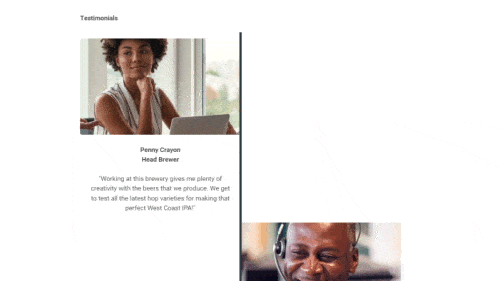
The FlipCard component can be used in various ways to display important information and imagery. The front of the card utilises a showcase image underlined with title & text. When you hover the card, the flip animation activates, showing a short phrase or sentence. This can be very useful for criteria such as Meet the Team (profile cards), Testimonials, Company Values, and much more.

- Front image: Good quality .jpg file at 72dpi, square in size, with a central focus.
- Provide a header title, and/or text, with some text for the back of the card as well.
- Use a similar character length to what is show in the preview.
- Maximum 3 cards to a row with multiple rows possible.
- Card-back colour customisations: Background and text can be Primary/Secondary/Dark colour combinations as long as accessible.
- Image resizing and cropping may occur.System responsive
The Paragraph & Image component allows you to present a paragraph of text alongside a single image. This component allows you to provide the user with a large amount of content accompanied with an image to break it up. By default the image will be on the left side and the paragraph on the right but this can be altered if you require it to be. This component can be used for the main bulk of your content and repeated across our range of products. We advise you to keep the content within each component to a minimum and use multiple Paragraph & Image components if you have a lot of content. This component can also make use of a single button at the end of your paragraph of text which takes the user to either an external site or different page.
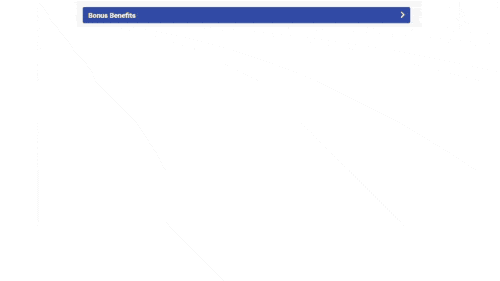
The icon accordian is a great content component to show off a long list of your benefits as an example if you want to show a lot more than just a few highlights, however this is only using our Font Awesome icon library.
- Provide short single wording for best results.
- Maximum of 16 icons
- Intro / Exit paragraph can be hidden if not needed, however no word limit.
- Font awesome icons only - this compnent doesnt support your own icons.
The Paragraph & Image component allows you to present a paragraph of text alongside a single image. This component allows you to provide the user with a large amount of content accompanied with an image to break it up. By default the image will be on the left side and the paragraph on the right but this can be altered if you require it to be. This component can be used for the main bulk of your content and repeated across our range of products. We advise you to keep the content within each component to a minimum and use multiple Paragraph & Image components if you have a lot of content. This component can also make use of a single button at the end of your paragraph of text which takes the user to either an external site or different page.
This component can be used to display important historical events of the company, or even used for step-by-step information for a process or application.
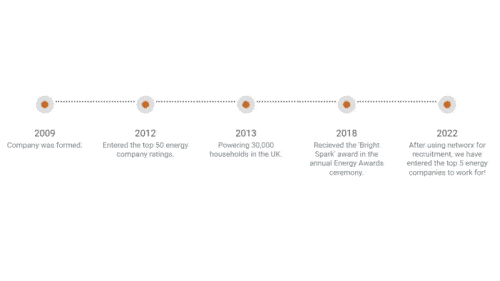
- Provide a header title (Date/year etc.) and accompanying text at a similiar character length as show in the preview.
- There are 5 timeline events to a row, with multiple rows possible.
- Timeline dot is available in system Primary/Secondary/Dark colours.
The Paragraph & Image component allows you to present a paragraph of text alongside a single image. This component allows you to provide the user with a large amount of content accompanied with an image to break it up. By default the image will be on the left side and the paragraph on the right but this can be altered if you require it to be. This component can be used for the main bulk of your content and repeated across our range of products. We advise you to keep the content within each component to a minimum and use multiple Paragraph & Image components if you have a lot of content. This component can also make use of a single button at the end of your paragraph of text which takes the user to either an external site or different page.
This component can be used to display important historical events of the company, or even used for step-by-step information for a process or application.
- Provide a header title (Date/year etc.) and accompanying text at a similiar character length as show in the preview.
- Customisable: Background colour of the text can be system primary or system secondary colour.
We can include an embedded Vimeo or YouTube video in our range of products. This can provide users with a more indepth view into your company, present them with the benefits of working with you or anything else you can contain within a short video. It is advised to keep the video short, we advise under 2 minutes, as anything longer than this may lose the attention of a potential candidate and keep them from applying for a vacancy.
- Provide the url of the video.
- Video's can be hosted on the networx account for an unbranded and more premium experience. Fee's Apply
- For maximum conversion: Keep the video less than 2 minutes.
- Styling not customisable. Nothing to Style
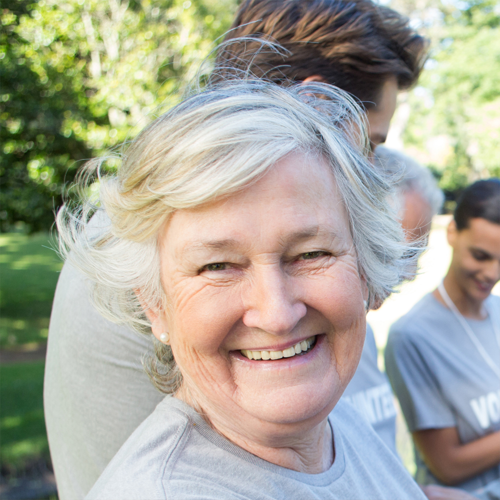
This section allows the display of a group of images, each supported by a title and text. While technically there is no restriction on the number of images that can be added here, we recommend that they are provided in multiples of three and have up to a maximum of three rows (9 images). We must be provided with good quality images that we can scale to the appropriate size, anything above 500x500 pixels. We also require the title and text for each image. These images can be displayed square or circular.

Anna SteeleSenior HR Partner

Nathan HessionHR Manager
Alicia NolanAccount Development Manager

Amanda MatherData Analyst

Robert HewittProject Manager

Matthew VickersC.E.O
- Provide images at 500x500 pixels or larger.
- For maximum conversion: Use a maximum of 9 images in multiples of three.
- Customisation options available.
The carousel feature allows you to present a selection of sliding images. This component can be used to provide any user with lots of content without taking up too much space. You can present a maximum of five images on this slider, this is to ensure any user is not overwhelmed with too much information and is distracted from the aim of our products. The carousel can be altered to span the full width of the screen or be presented smaller if the content requires it to be.
- Provide images at 1000x1000 pixels or larger.
- Maximum of five images per carousel.
- Styling not customisable. System Driven
This section allows the display of a group of icons, each supported by a title. While technically there is no restriction on the number of icons that can be added here, we recommend that they are provided in multiples of three and have up to a maximum of three rows (9 images). We must be provided with the titles for this section along with the order they are to be displayed. By default we will source the icons for you using a service called Font Awesome, this is the service we use for any other icons used across our products and this is to build up a layer of consistency.
Private Healthcare
Company Bonus Scheme
Development Scheme
Free Tea & Coffee
Cycle To Work Scheme
Choice of Equipment
- Provide each feature with no more than 20 characters of text (including spaces).
- Provide the name (Title) of the section. I.E. "Why Us?".
- Fontawesome icons used by default.
- For optimal conversion: Use primary brand colour.
- Customisable: Primary or secondary brand colour used for the icon & text. AA Restrictions
The Image & Button component allows you to provide up to 5 images each with an attached button. This component can be used for a wide variety of purposes for example presenting a range of sub level brands. You can provide up to five images and specify where each button should link to. Depending on the product this component is used on the buttons can either link to a different page on the product or an external site of your choosing.
- Maximum five images and buttons.
- Buttons can link to a different page on the same site or an external site.
- Buttons use primary colour by default.
- Customisable: Primary or secondary brand colour used for buttons. AA Restrictions
- Customisation options available.
The Image & Image component allows you to present a two images alongside one another. This component can be used to provide photos or images to support content found in other components. These two images will be displayed alongside each other both filling half of the available space. This gives each image equal focus and makes the Image & Image component easier to line up with other components which can provide further information on each image.
- Maximum two images.
- Both images to be provided in a large format using the same size.
This button component allows you to add a button to any of our products. This gives you the option to present the user with a clickable link which stands out from the rest of your content. The use of this component can vary across our products and templates. The button can be used to either link to another page of the site or an external site. This means it can be used as a navigation tool on your site or take a user to your companies website for further information.
- Button can link to a different page on the same site or an external site.
- Button uses primary colour by default.
- Customisable: Primary or secondary brand colour used for button. AA Restrictions
The title and paragraph component allows you to present a section of text with it's own accompanying title. This basic content component can be used to provide the user with a lot of information in a single area. This component is best used amongst other, more complex, components in order to break up your content.
Placeholder Title
This is a paragraph of placeholder text. You will be able to fill in this text area with your content. We advise you don't overfill the text area with too much content. This is to ensure the user isn't overfaced with content and entices the user to read what you have to say.
- Component can hold a title and area of text.
- For optimal conversion: Don't overfill the text area with content.
The paragraph component allows you to present a section of text on it's own. This basic content component can be used to provide the user with a lot of information in a single area. This component is best used amongst other, more complex, components in order to break up your content.
This is a paragraph of placeholder text. You will be able to fill in this text area with your content. We advise you don't overfill the text area with too much content. This is to ensure the user isn't overfaced with content and entices the user to read what you have to say.
- For optimal conversion: Don't overfill the text area with content.
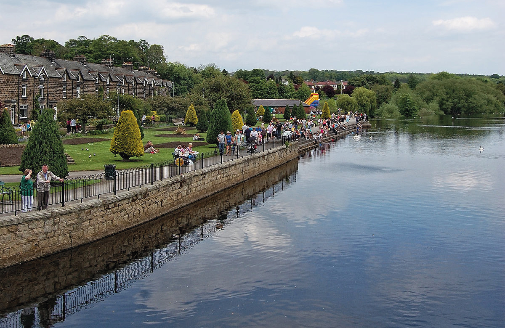
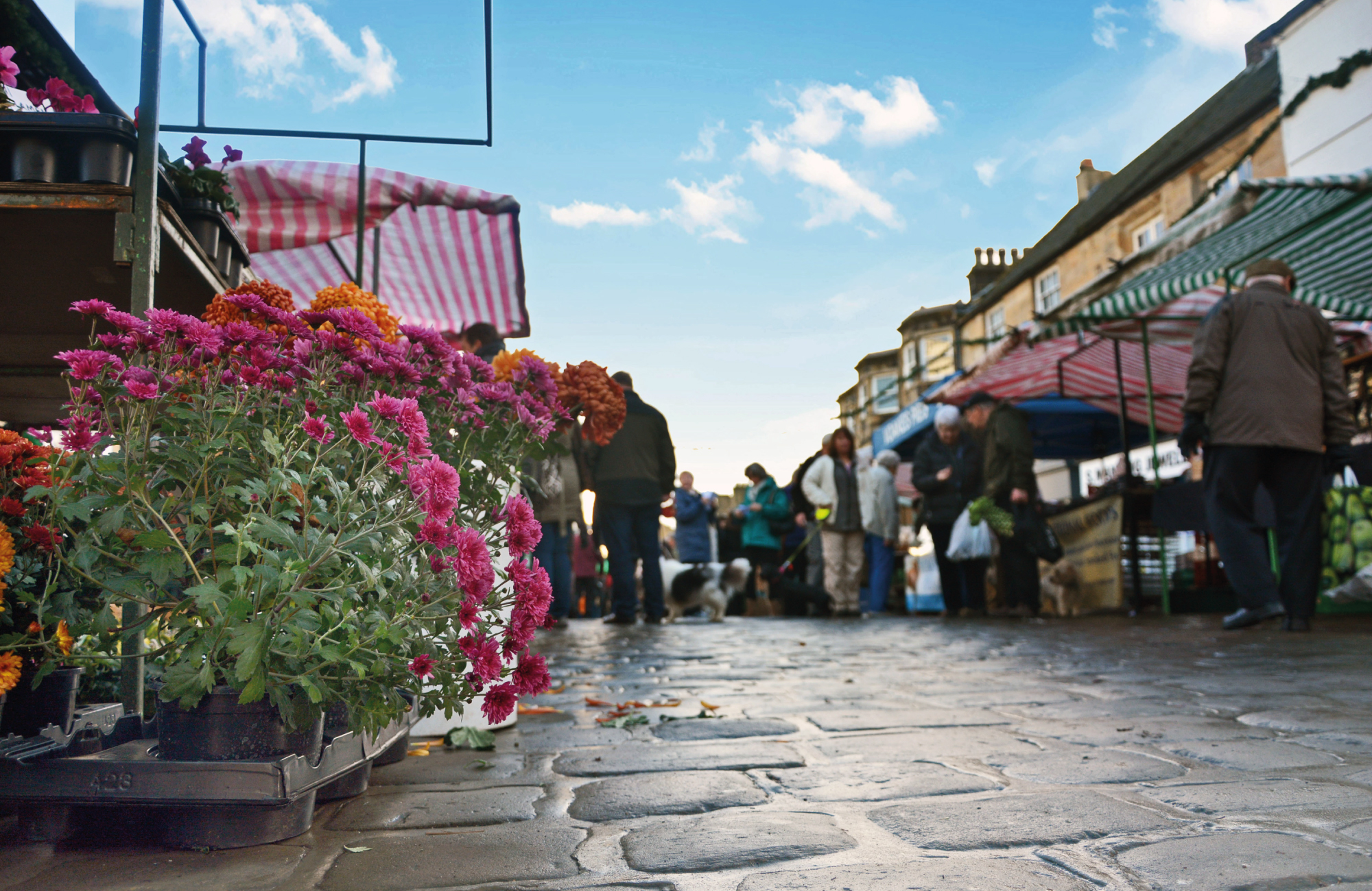
The image component can be used across our range of products to present the user with a full width image. This can be used to showcase an important image and give it a large impact due to the size of it. This basic component can only be used to present a single image, due to this it is best when combined with other components in order to provide a user with the content you have.
- Provide a single, large format, image.
- Styling not customisable. System Driven
The Paragraph & Image component allows you to present a paragraph of text alongside a single image. This component allows you to provide the user with a large amount of content accompanied with an image to break it up. By default the image will be on the left side and the paragraph on the right but this can be altered if you require it to be. This component can be used for the main bulk of your content and repeated across our range of products. We advise you to keep the content within each component to a minimum and use multiple Paragraph & Image components if you have a lot of content. This component can also make use of a single button at the end of your paragraph of text which takes the user to either an external site or different page.
Best Companies to Work For
As a business we are incredibly proud to be consistently recognised as one of the Best Companies to Work, receiving the highest possible 3 star accreditation and ranked as one of The Sunday Times Top 100 Small Companies to Work For 2020, and for the last four consecutive years. networx is also officially ranked as the 9th Best Company to Work For in Yorkshire and The Humber.
Our commitment to delivering high quality solutions starts with our people. It is the unrivalled skills of our employees that allow networx to support clients in a unique and highly tailored manner and reflect their specific needs.
- Provide a single, large format, image along with a paragraph of text.
- Customisable: Order of paragraph & image can be changed. AA Restrictions
- Styling not customisable. System Driven
The Accordion Dropdown component allows for a large amount of text content to be presented as a dropdown. This allows you to provide a large amount of content to the user without creating a large page and overface the user. This component can be used on its own to hide a single section of content behind a single title or paired with multiples of the Accordion Dropdown component to create a larger accordion feature. These dropdowns can be set to either hide or display the content as a default.
Lorem ipsum dolor sit amet, consectetur adipiscing elit. Morbi et elit congue, bibendum mauris in, vestibulum elit. Cras non ligula eros. Morbi viverra posuere ex, vitae bibendum diam malesuada eu. Integer nec malesuada lacus, id ornare mauris. Integer commodo odio eu porta euismod. Nullam pulvinar, risus a ullamcorper rhoncus, arcu arcu dapibus lacus, in congue risus nibh tincidunt ante. Vivamus a viverra massa. Aenean consectetur risus lacus, vel accumsan mauris feugiat vel. Pellentesque sit amet est laoreet leo gravida tristique. Morbi id mi nisi. Proin ac vestibulum ligula.
Lorem ipsum dolor sit amet, consectetur adipiscing elit. Morbi et elit congue, bibendum mauris in, vestibulum elit. Cras non ligula eros. Morbi viverra posuere ex, vitae bibendum diam malesuada eu. Integer nec malesuada lacus, id ornare mauris. Integer commodo odio eu porta euismod. Nullam pulvinar, risus a ullamcorper rhoncus, arcu arcu dapibus lacus, in congue risus nibh tincidunt ante. Vivamus a viverra massa. Aenean consectetur risus lacus, vel accumsan mauris feugiat vel. Pellentesque sit amet est laoreet leo gravida tristique. Morbi id mi nisi. Proin ac vestibulum ligula.
Lorem ipsum dolor sit amet, consectetur adipiscing elit. Morbi et elit congue, bibendum mauris in, vestibulum elit. Cras non ligula eros. Morbi viverra posuere ex, vitae bibendum diam malesuada eu. Integer nec malesuada lacus, id ornare mauris. Integer commodo odio eu porta euismod. Nullam pulvinar, risus a ullamcorper rhoncus, arcu arcu dapibus lacus, in congue risus nibh tincidunt ante. Vivamus a viverra massa. Aenean consectetur risus lacus, vel accumsan mauris feugiat vel. Pellentesque sit amet est laoreet leo gravida tristique. Morbi id mi nisi. Proin ac vestibulum ligula.
- Provide a single, large format, image along with a paragraph of text.
- Customisable: Order of paragraph & image can be changed. AA Restrictions
- Styling not customisable. System Driven
Social Media Icons
(Click for more info)
The social media icons can differ across our range of products but generally sit at the bottom of a page. They are often displayed in the footer and allow you to navigate (by means of a new tab that opens up, so not to drive you away from the advert) to the respective social media platform. You may choose any combination of these icons and must provide a URL to the respective profile page.